In this tutorial for Seaborn, we’ll walk through how to use Seaborn, a statistical data visualization library in Python, to explore the famous Titanic dataset. We’ll use various visualizations to understand factors that contributed to survival.
Table of Contents
- Setup and Installation
- Reading Data
- Basic Plots
- Categorical Data Plots
- Distribution Plots
- Pair Plots
- Heatmaps
- Conclusion
1. Setup and Installation
Install Seaborn and Pandas:
pip install seaborn pandas2. Reading Data
Seaborn comes with some built-in datasets, one of which is the Titanic dataset.
import seaborn as sns
import pandas as pd

# Load the Titanic dataset
df = sns.load_dataset('titanic')
3. Basic Plots
3.1 Count Plot
Visualize the number of survivors and non-survivors.
sns.countplot(x='survived', data=df)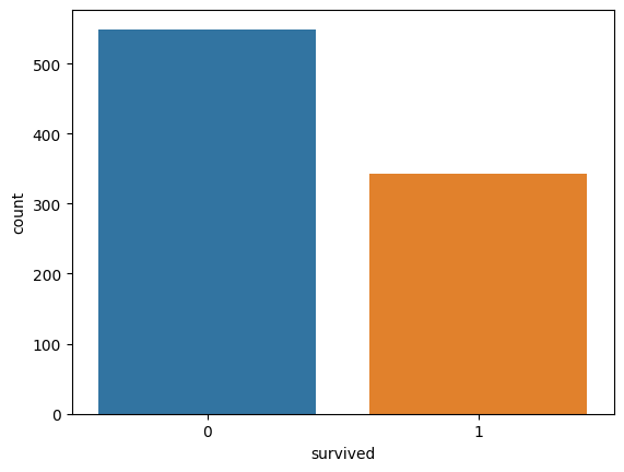
4. Categorical Data Plots
4.1 Survival by Class
Use a bar plot to show survival rates by class.
sns.barplot(x='class', y='survived', data=df)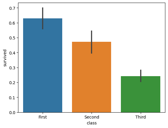
4.2 Survival by Sex and Class
Show survival by both sex and class.
sns.catplot(x='class', y='survived', hue='sex', kind='bar', data=df)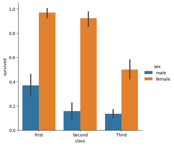
5. Distribution Plots
5.1 Age Distribution of Survivors
Plot a histogram to show age distribution among survivors.
sns.histplot(df[df['survived'] == 1]['age'], kde=True)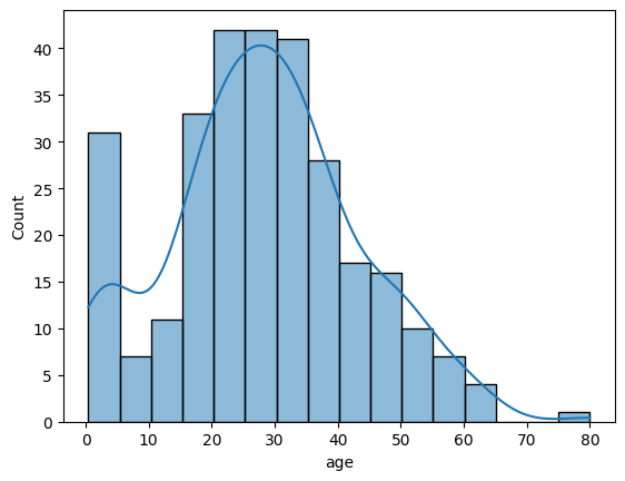
6. Pair Plots
Plot pairwise relationships in the dataset.
sns.pairplot(df[['age', 'fare', 'class', 'survived']], hue='survived')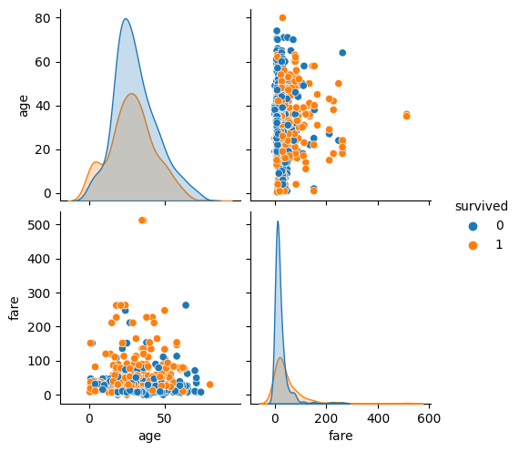
7. Heatmaps
Visualize a correlation matrix to explore relationships between numerical features.
# Compute correlation matrix
corr_matrix = df.corr()

# Draw a heatmap
sns.heatmap(corr_matrix, annot=True, cmap='coolwarm')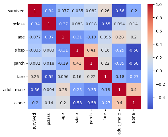
8. Conclusion
We used Seaborn to explore the Titanic dataset, visualizing survival rates by different factors like class and sex, distributions of numerical variables, and correlations between features.
Congratulations, you’ve successfully completed the tutorial! The Seaborn library offers many more types of plots and customization options to explore.
Feel free to adapt these methods to your own datasets and research questions!

