In the realm of data science and analysis, effective visualization is a cornerstone for conveying insights and making informed decisions. Python, with its powerful data visualization library, Matplotlib, empowers developers and data scientists to create visually compelling plots and charts. In this blog post, we’ll take a deep dive into Matplotlib, covering its fundamental concepts, various plot types, customization options, and advanced techniques. By the end, you’ll have a solid grasp of Matplotlib’s capabilities and be well-equipped to create stunning visualizations for your projects.
Table of Contents
- Introduction to Matplotlib
- Basic Plotting with Matplotlib
- Essential Plot Types
- Subplots and Multiple Plots
- Advanced Customization
- Working with Real Data
- Saving and Sharing Plots
- Conclusion
- Tutorials
Introduction to Matplotlib
Matplotlib is a comprehensive data visualization library in Python. It offers a wide range of plotting options, from basic line plots to complex 3D visualizations. To get started, make sure you have Matplotlib installed:
pip install matplotlibImport it into your Python scripts or notebooks using the following line:
import matplotlib.pyplot as pltBasic Plotting with Matplotlib
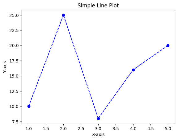
Let’s begin with a simple line plot example:
import matplotlib.pyplot as plt

# Data
x = [1, 2, 3, 4, 5]
y = [10, 25, 8, 16, 20]

# Create a line plot
plt.plot(x, y, marker='o', color='blue', linestyle='--')

# Adding labels and title
plt.xlabel('X-axis')
plt.ylabel('Y-axis')
plt.title('Simple Line Plot')

# Show the plot
plt.show()
Essential Plot Types
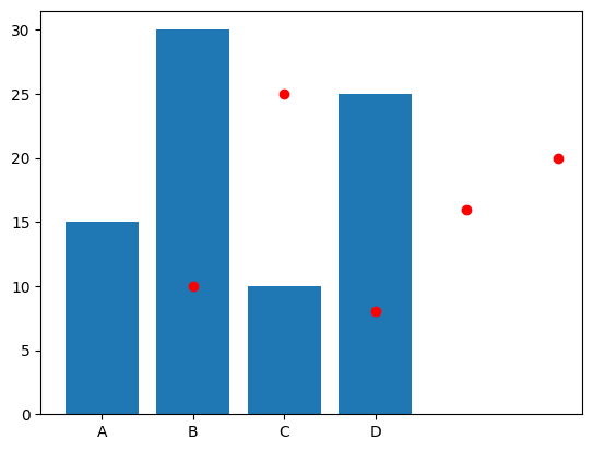
Matplotlib supports various plot types to cater to different data visualization needs. Here’s an example of a bar chart and a scatter plot:
import matplotlib.pyplot as plt

# Bar chart
categories = ['A', 'B', 'C', 'D']
values = [15, 30, 10, 25]
plt.bar(categories, values)

# Scatter plot
x = [1, 2, 3, 4, 5]
y = [10, 25, 8, 16, 20]
plt.scatter(x, y, color='red', marker='o')

plt.show()
Subplots and Multiple Plots
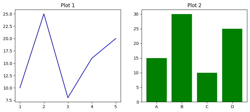
You can create multiple plots within the same figure using subplots:
import matplotlib.pyplot as plt

# Creating subplots
fig, axes = plt.subplots(1, 2, figsize=(10, 4))

# Subplot 1
axes[0].plot(x, y, color='blue')
axes[0].set_title('Plot 1')

# Subplot 2
axes[1].bar(categories, values, color='green')
axes[1].set_title('Plot 2')

plt.show()
Advanced Customization
Matplotlib offers extensive customization options for fine-tuning your plots:
import matplotlib.pyplot as plt

# Creating a line plot
plt.plot(x, y, marker='o', color='blue', linestyle='--')

# Adding annotations
plt.annotate('Peak', xy=(3, 8), xytext=(3.5, 15),
             arrowprops=dict(facecolor='black', shrink=0.05))

# Adding legend
plt.legend(['Data'], loc='upper left')

# Adding grid
plt.grid(True)

plt.show()
Working with Real Data
Matplotlib works seamlessly with real-world data, especially when combined with pandas:
import matplotlib.pyplot as plt
import pandas as pd

# Loading data with pandas
data = pd.read_csv('data.csv')

# Plotting time series data
plt.plot(data['Date'], data['Value'])
plt.xlabel('Date')
plt.ylabel('Value')
plt.title('Time Series Data')
plt.xticks(rotation=45)
plt.show()
Saving and Sharing Plots
You can save your Matplotlib plots as image files:
import matplotlib.pyplot as plt

# Creating a plot
plt.plot(x, y)

# Save the plot to a file
plt.savefig('plot.png')

plt.show()
Conclusion
Matplotlib is a versatile library that empowers you to create captivating visualizations to convey insights effectively. With a solid understanding of its concepts and functionalities, you can create a wide range of plots, from basic charts to intricate 3D representations. By exploring its customization options, you can fine-tune your plots to match your specific needs. Whether you’re an analyst, developer, or data scientist, mastering Matplotlib will undoubtedly enhance your data visualization skills and contribute to more impactful communication of data-driven insights.
