Python Tutorial for Matplotlib: In this tutorial for matplotlib, we will walk through a use-case of how to visualise stock price data using Matplotlib, a plotting library for Python. Our aim is to visualise historical stock prices and moving averages for a given stock.
Table of Contents
- Setup and Installation
- Reading Data
- Basic Line Plot
- Multiple Plots
- Moving Averages
- Annotations and Style
- Conclusion
1. Setup and Installation
First, let’s install Matplotlib and Pandas for data handling:
pip install matplotlib pandas2. Reading Data
CSV file for the stock data can be downloaded form the link: stock_data.csv. The data file contains columns Date, Open, High, Low, Close.
import pandas as pd

# Read the stock data
df = pd.read_csv('stock_data.csv', parse_dates=['Date'])
df = df.sort_values(by=['Date'])
3. Basic Line Plot using Matplotlib
Plot the stock’s closing prices.
import matplotlib.pyplot as plt

# Basic Line Plot
plt.plot(df['Date'], df['Close'])
plt.xlabel('Date')
plt.ylabel('Close Price')
plt.title('Stock Closing Prices')
plt.show()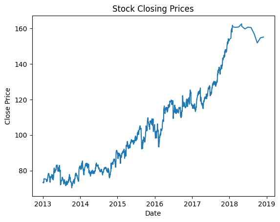
4. Multiple Plots in Matplotlib
Let’s visualize the stock’s high and low prices along with the closing prices.
# Multiple Line Plots
plt.plot(df['Date'], df['High'], label='High Price')
plt.plot(df['Date'], df['Low'], label='Low Price')
plt.plot(df['Date'], df['Close'], label='Close Price')
plt.xlabel('Date')
plt.ylabel('Price')
plt.title('Stock Prices')
plt.legend()
plt.show()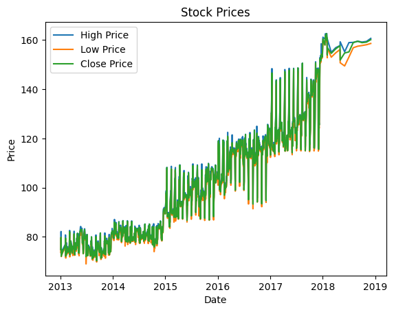
5. Moving Averages
Visualize 20-day and 50-day moving averages
# Calculate Moving Averages
df['20_day_avg'] = df['Close'].rolling(window=20).mean()
df['50_day_avg'] = df['Close'].rolling(window=50).mean()

# Plot Moving Averages
plt.plot(df['Date'], df['20_day_avg'], label='20-Day Avg')
plt.plot(df['Date'], df['50_day_avg'], label='50-Day Avg')
plt.xlabel('Date')
plt.ylabel('Price')
plt.title('Stock Prices with Moving Averages')
plt.legend()
plt.show()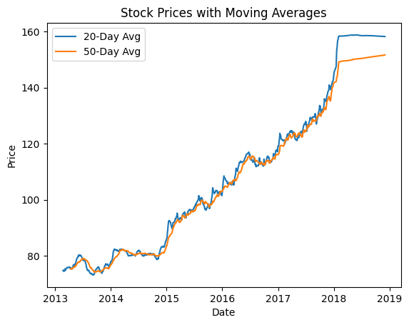
6. Annotations and Style
Let’s mark the maximum closing price with text annotation.
# Find Maximum Close Price
max_close = df['Close'].max()
date_max_close = df[df['Close'] == max_close]['Date'].iloc[0]

# Annotations
plt.plot(df['Date'], df['Close'], label='Close Price')
plt.annotate(f'Max: {max_close}', xy=(date_max_close, max_close), xytext=(date_max_close, max_close+10),
             arrowprops=dict(facecolor='red', arrowstyle='->'),
             fontsize=9, color='red')
plt.xlabel('Date')
plt.ylabel('Price')
plt.title('Stock Closing Prices with Annotation')
plt.show()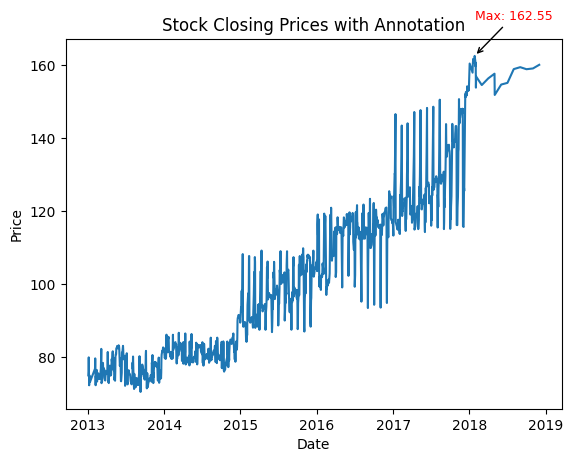
7. Source Code
Full source code : stock_analyzer.py
8. Conclusion
You have now learned how to read stock data, visualize it using different types of line plots, compute moving averages, and add annotations using Matplotlib. This is a foundational example, and the possibilities with Matplotlib are almost endless.
Congratulations, you’ve successfully completed this python tutorial for Matplotlib! Feel free to adapt this approach to visualize different kinds of data and create various types of plots. Matplotlib offers a wide array of functionalities that can cater to a diverse set of plotting requirements.

